Role
Co-Designer
Team
Fin Taylor
Duration
6 Weeks
Focus
Branding, Visual Design
Overview
Amazon is a global leader in convenience and efficiency, but often lacks emotional resonance and environmental responsibility. 'Amado' reimagines Amazon with a new identity focused on human connection, transparency, and sustainability across both digital and physical space.
Problem Statement
Amazon is a global leader in convenience and efficiency, but is often criticized for lacking transparency and environmental responsibility. How can we reimagine Amazon as a brand that puts people and the planet first?
Goals
Make the brand more emotionally engaging and personal
Introduce sustainable values across branding and packaging
Create a consistent, flexible visual identity system
Align digital UX with a more human, ethical voice
Research and Insights
Make the brand more emotionally engaging and personal
Introduce sustainable values across branding and packaging
Create a consistent, flexible visual identity system
Align digital UX with a more human, ethical voice
Concept Development
First, we focused on establishing a clear and concise brand identity to guide our design process.
Brand Identity Prism
The identity prism was essential in defining the core values of Amado : sustainability, emotional connection, and transparency. Instead of starting with visuals, we used the prism as a foundation to guide the entire rebranding process.
It helped shape a consistent voice and informed decisions across visual and physical elements, ensuring the brand remained cohesive, intentional, and value-driven.

Mood Board
Next, we began by creating a mood board that explored a visual tone of our brand's values: sustainability, emotional connection, and transparency.

Naming and Sketching
Then we sketched ideas for branding.
Why "Amado"?
"Amado" means 'beloved' in Spanish. The name conveys warmth, care, and cultural depth.

Why the Leaf ?
We chose to design two interlocked leaves, evoking an upside down heart shape, that emphasizes our brand's environmental values.

Visual Identity System
After establishing our brand identity, we focused on creating a cohesive design system that reflected Amado's personality and values.
Logo Design
This is our horizontal design. It should be used as our most extensive version. We chose to incorporate a leaf as the first “A” in Amado to connect our brand's emphasis on both environmentally-friendly and community-based practices.
Other Logo Uses Include:

This is our leaf logo, the image of our brand. It can also be used upside, as shown to the right, to mimic a heart and truly connect our logo to our name.


Lastly, we have our text logo. This logo is geared for more type focused branding. The font uses organic curves and a lowercase, handwritten-like form to convey approachability.
Color Palette
We explored a range of palettes, testing combinations that felt inviting, grounded, and environmentally conscious.

Earlier palettes leaned too muted, lacking the vibrance and emotional warmth we hoped to potray.
We settled on a soft, earthy, and emotionally intelligent palette of colors.

Grounded in green and softened by sand and mint, our final palette strikes a balance between ecological intent and approachability.
Amado Green conveys energy, optimism, and ecological action
Mild Sand brings approachability and softness, echoing recycled textures
Forest Pine adds depth and trust, suggesting reliability and grounded values
Highlight Mint is playful and fresh, ideal for moments of highlight in the UI
Zinc Grey neutralizes the palette, providing clarity and calmness
Typography System
Company Font

Headers

Body Text

Bringing Amado to Life
Applying Amado’s brand identity across physical and digital spaces allowed us to reinforce its values, sustainability, emotional connection, and transparency, through real-world interactions.
Website & Mobile App
The website experience prioritizes clarity, calmness, and accessibility—guiding users through a more mindful approach to shopping.
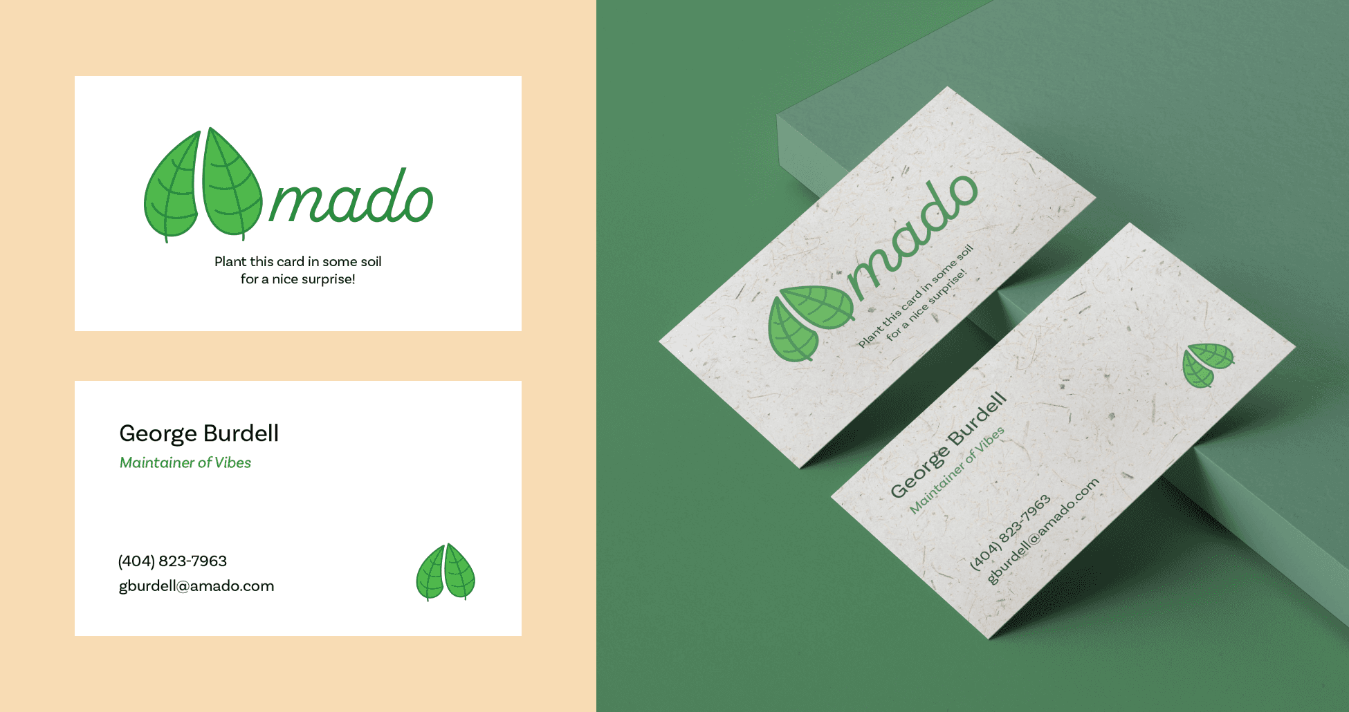
Print Material
Our print materials bring Amado’s tone to life in public spaces, inviting communities to slow down and shop consciously.
We began with the business card, intentionally printed on seed paper—so instead of being thrown away, it can be planted and grow into something new.
We then designed a poster that invites the community to a local farmers market to spotlight small businesses and sustainable food practices.


Lastly, we designed a large-scale billboard to maximize visibility and extends Amado’s mission into public space, encouraging passersby to reconsider how and where they shop.

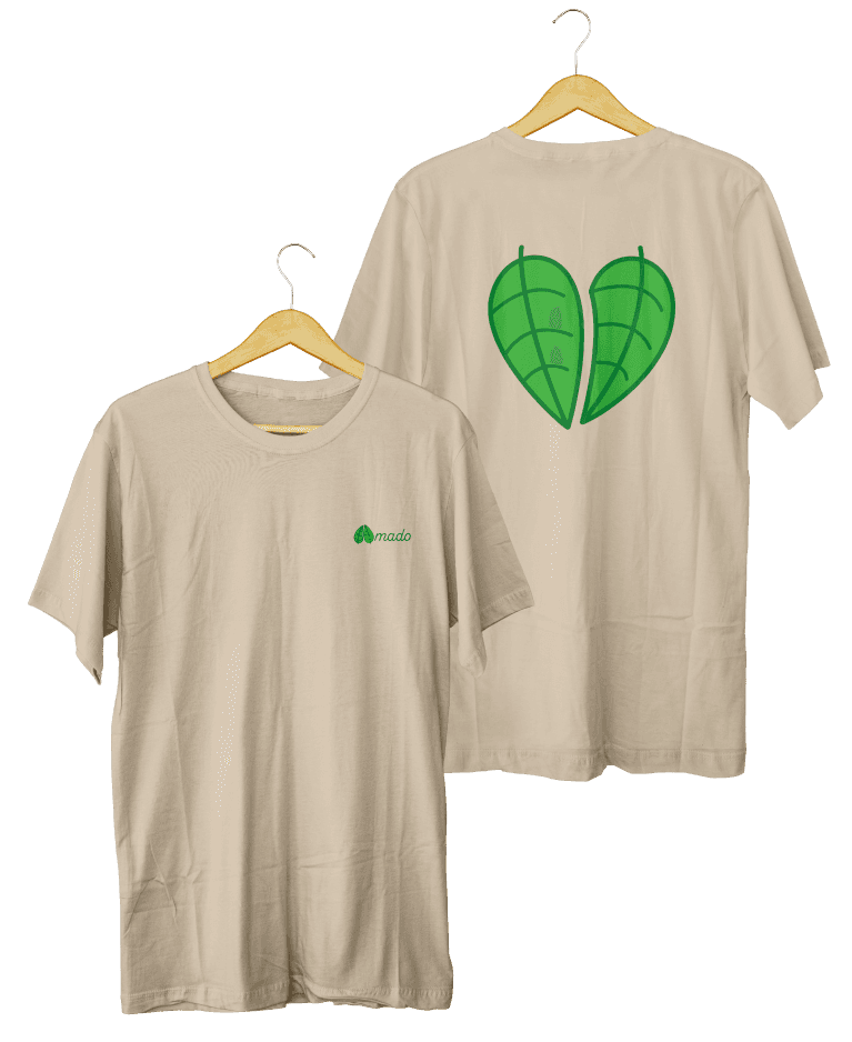
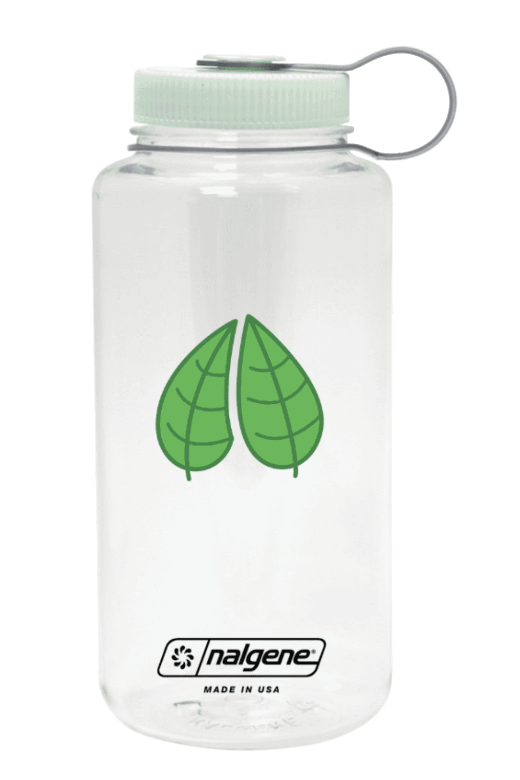
Merchandise
We designed a line of branded merchandise to extend Amado’s identity into personal, everyday objects. Each item reflects the brand’s commitment to sustainability and human connection, turning functional goods into conversation pieces.
A reusable Nalgene water bottle with out graphic logo and highlight mint color for the cap. Made out of recycled BPA-free plastic.
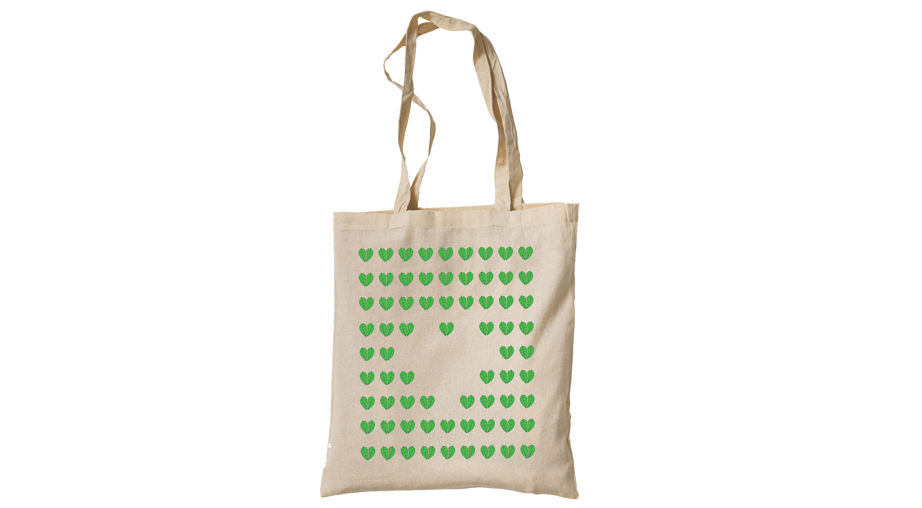
A tote bag made up of many of our logo leaving white space outlining a heart shape.
A simple t-shirts with our logo and wordmark on the front and the large heart variation on the back.